20 Jun 2024

The North American fashion and accessories market recently welcomed the new Pilgrim stores, the renowned Danish brand of jewellery and accessories. Robert P. Hayes, CEO of Pilgrim North America, aimed to re-imagine the concept of the brand's stores to better align them with the preferences of North American customers while preserving their distinctly Scandinavian essence. He entrusted Entre Quatre Murs, an emerging interior design and architecture firm based in Montreal, specializing in creating immersive retail environments, with the task of striking a balance between the brand's identity and existing furniture, all while adopting a more enticing approach better suited to the preferences of Canadian consumers.
Visual and tactile harmony: redefining the shopping experience
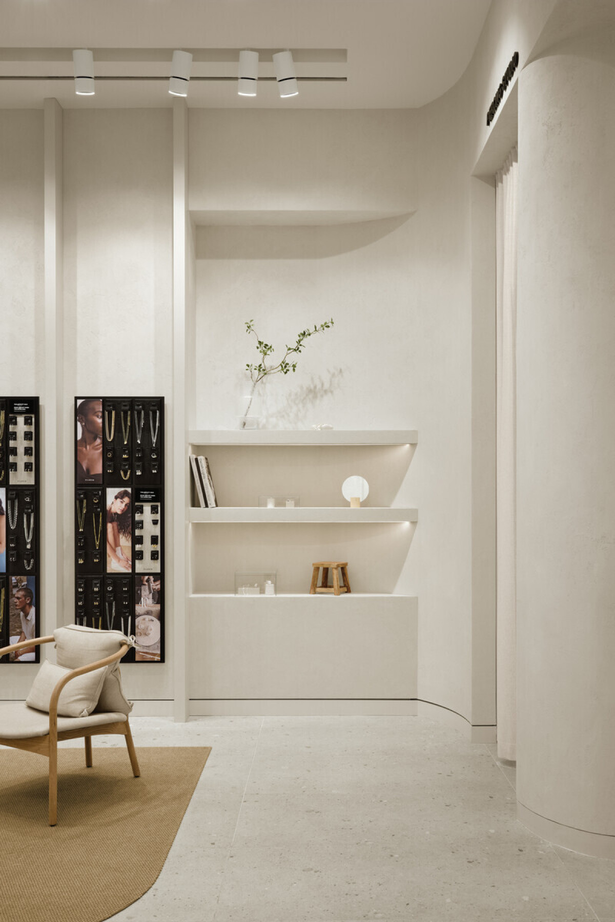
Upon entering the store, the conceptual intentions are clearly defined: to create a welcoming and elegant atmosphere by skillfully playing with details and textures. The existing black wall displays, a brand hallmark, elegantly blend with a light background, creating a visual contrast that highlights the jewellery. The primary innovation lies in the use of a continuous material: a Venetian plaster finish that evokes a more tactile and enveloping dimension of the shopping experience. This material not only covers the walls, but also the ceiling bulkhead above the counter, the new cylindrical displays, and the scattered oval tables throughout the store, thus creating a more immersive experience. The incorporation of curves and soft shapes in the textured furniture and walls subtly evokes the aesthetics of the human body, contributing to the creation of a welcoming and soothing environment.
The new layout prominently features a subtle blend of the brand's existing furniture while introducing a striking custom black central island. With its straight, defined lines, this island contrasts with the rest of the interior, immediately drawing the eye upon entry and inviting customers to sit, interact with the staff, and explore the featured collections. Two individual fitting stations have also been added on either side of the space to offer a more personalized experience for customers who wish to shop more privately.
The art of creating a welcoming space
The concept is further enriched with a small central lounge area, allowing customers to take a break or comfortably wait for a companion while getting acquainted with Pilgrim's products. This lounge, accompanied by decorative shelves integrated into the walls, brings a cosy and inviting feeling. Not far from there, a dedicated piercing area, discreetly placed at the back of the store but visible from the entrance, adds a service dimension to the store, inviting customers to consider the piercing experience on-site.
The cash register counter is cleverly positioned under a ceiling bulkhead housing a faux skylight above a plant basin, adding a natural and refreshing touch to the entire store, which unfortunately lacks natural light. Plants and pebbles are also placed on the storefront and at the back of the store to enhance the feeling of a garden, nature, and delicacy that characterizes the Pilgrim brand.
Finally, several islands and different display models have been integrated to offer customers a dynamic shopping experience, while providing versatility in how to showcase and highlight the products.
Perception and sensation are at the core of the concept
The goal of this conceptual redesign was to ensure that customers feel comfortable and take the time to discover the products.
"The ultra-minimal aspect of the concept originally implemented in Europe, which was perfectly aligned with Scandinavian values, needed a reinterpretation to stand out in the North American market," explains Gatline Artis, interior designer and owner of Entre Quatre Murs. "The idea was to maintain great simplicity in materiality, but to offer a shell rich in details to guide visitors into a world as refined as the jewellery Pigrim offers."
In summary, Pilgrim is adapting its stores to the North American market by merging Scandinavian simplicity with sophisticated details. With a warm ambience, clever layout, and attention to detail, this new store offers a space where customers can relax and leisurely explore their entire range of products. This transformation promises to attract the attention of fashion and jewellery enthusiasts seeking a unique, simple, and refined shopping experience.
Technical sheet