02 Nov 2022

Origami, a favourite Jumeirah neighbourhood eatery and homegrown Dubai concept, now has a new home at The Dubai Mall. The restaurant, launched in 2014 to offer a fresh take on quality-grade sushi in Dubai, has an entirely new look at its recently opened branch.
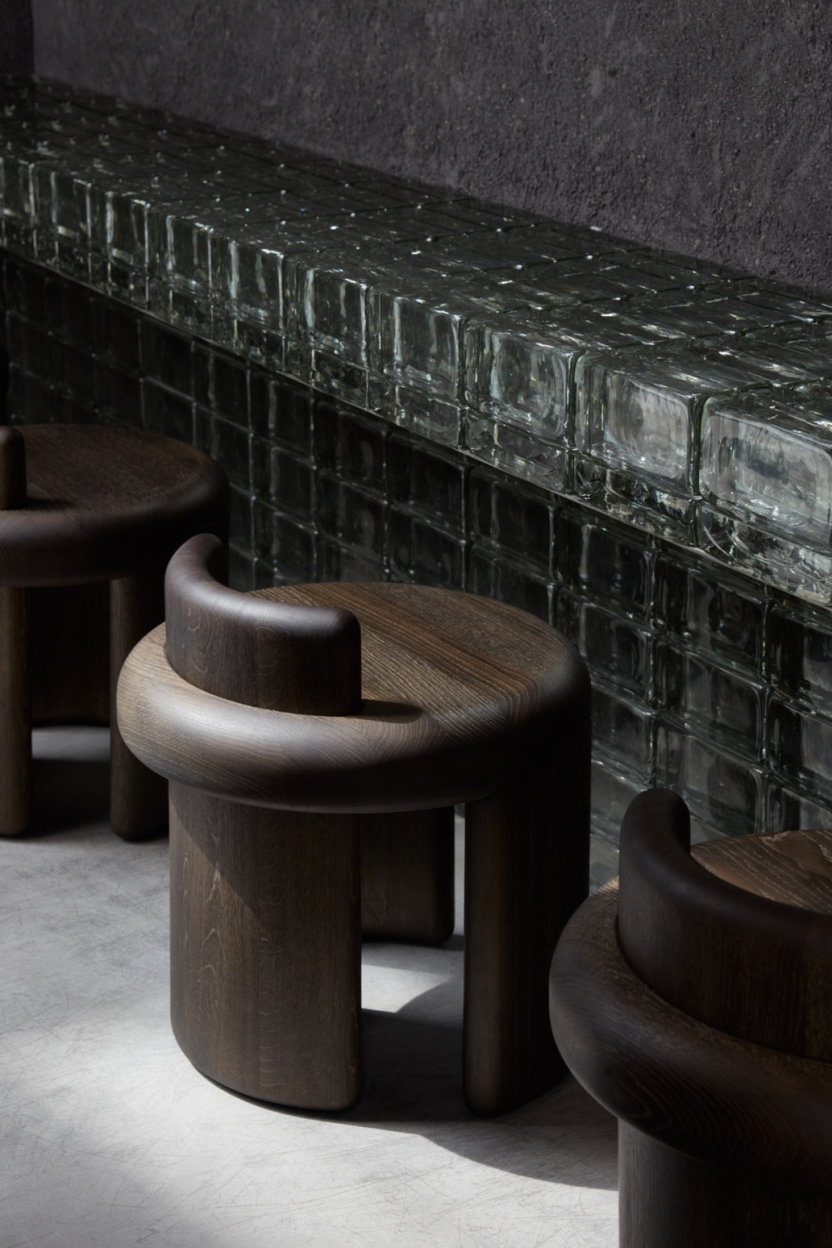
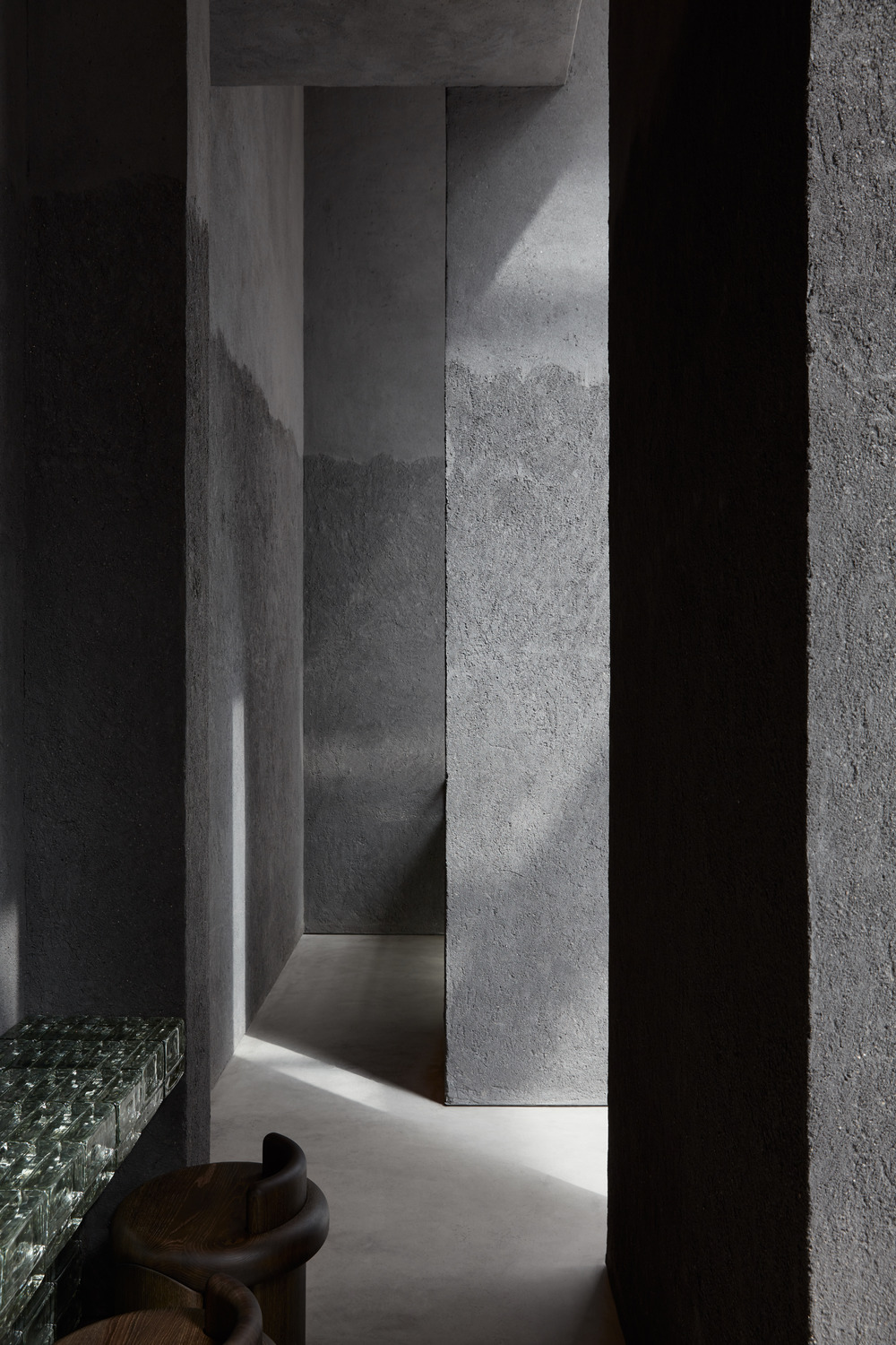
Designed by Dubai-based VSHD Design, Origami’s interior makeover features simple forms in natural materials, and organic shapes reflecting the simplicity and minimalism of traditional Japanese culture. Its architecture presents a temple-like structure covered in a dense texture of clay, with its grey hue emphasizing the earthy material. The texture of the walls is further accentuated by plays of light and shadow, coupled with dim lightening that echoes the ambience of old underground Japanese sushi bars. Other additions include black matted tiles, draped seating, and textured glass partitions, providing the eatery with a new and authentic dining experience.
Also Read: Festive Home Decor: 10 accessories you should add to your home
The design evokes feelings of intrigue and mystery, as well as comfort, nobility, harmony, and luxury, all wrapped within the gentle ebb and flow of contemporary interiors reminiscent of the Japanese philosophy of finding beauty in humble simplicity.

VSHD’s design approach was all about creating a one-of-a-kind dining experience. Guests walk through six-meter thick rectangular-like columns into a space marked by a sense of secrecy - a place to escape and retreat from external noise for a moment of solitary or communal dining and contemplation.
Also Read: 7 Simple steps to Declutter your Work Space
While designing a space within The Dubai Mall has its challenges - notably the busy aesthetic ambience of a shopping mall - VSHD designed the entrance like a transitional space between the mall’s corridor and the main dining room of the restaurant. On one side, a small retail space sells chocolates, and on the opposite side, a low bar with stools hosts clients waiting to be seated inside.
Also Read | Shiro Kuramata’s Samba-M shines again with Ambientec at the supersalone in Milan
Importantly, the solid shop front façade made of rammed earth clay and glass bricks boasting a dark grey colour evokes a feeling of intrigue meant to draw people inside, with the hope that they might decide to stay for a sushi meal. Furthermore, the narrow entrance to the restaurant area is designed to control the intensity of natural light emanating into the main dining room. Inside, guests will discover a dim area that once again reflects the ambience of underground Japanese sushi restaurants.
The main dining area offers an impressive variety of seating arrangements spread across two levels. On the first level, built-in seating located along the parameter of the space offers flexible seating that can be rearranged according to the needs and desires of each customer. The second level features a sushi bar with a lightbox where diners can also view sushi chefs at work as they prepare their meals.
Also Read | Interior stylist Bhawana Bhatnagar on smart lockers at residential spaces
The dark ambience of the space creates a cocoon of comfort within a minimalist space where basic black tiles have been used to cover the walls, and built-in furniture offers a humble effect. Overall, it is the lines, the materials, and the colours incorporated within VSHD’s design that uphold a Japanese sensibility and spirit, while still appealing to a modern sense of luxury.
Also Read: Easy Guide To Choose A Color Palette For Your Space
Technical sheet