10 Apr 2023

The complete transformation of this unassuming single-storey worker’s cottage in Toronto’s historic "Tiny Town" turned a run-down house into a luminous and ethereal pandemic refuge. The client, Laurel Hutchison, is a retired schoolteacher living on a fixed income, with a budget earmarked for basic renovations to rescue her 112-year-old home from disrepair. The result is a 720 sf, delicately proportioned, light-filled home, built on its original foundations while re-envisioning every other aspect of the worker’s cottage vernacular – a turn-of-the-century housing typology that has almost completely disappeared from the city.

Context
Craven Road represents an unusual urban condition. Previously known as Erie Terrace, the street was originally developed to house lower-income labourers and immigrants in the early 20th century. With small dwellings lining only the street’s east side, and a municipal fence running along the west, this atypical thoroughfare was the site of Toronto’s highest concentration of detached homes under 500 sf. Today, Craven Road remains a close-knit community and unique architectural outpost in an increasingly unaffordable city.
Construction & Community
The project began with the goal of maintaining the original home’s single-storey footprint as a critical part of an ageing-in-place strategy for Laurel. To achieve this without undergoing a lengthy municipal approvals process that would force Laurel to leave her home longer than she could afford to, the house needed to be designed and permitted as a renovation. However, shortly after the builder mobilized on site, it was discovered that the top course of the foundation required reconstruction. To do this work would typically have entailed taking down the walls above the foundation, but this would have run counter to the City’s regulations, which required that at least 50% of the exterior walls remain in place for a project to qualify as a “renovation”, as opposed to a “new build” (which would trigger the approvals process). The solution; was a temporary shoring system that suspended the home’s above-ground shell in the air, giving the trades access to the foundation so it could be repaired, while also satisfying the building inspector’s requirement that at least 50% of the house’s original walls remained upright. This feat of engineering, architecture, and construction was partly made possible by the generosity of a neighbour who allowed the builder to use their rear concrete terrace as a buttress for anchoring a temporary shoring wall.
The reinvention of the Typology and the Client Brief
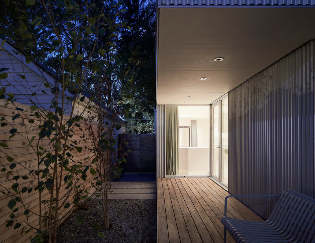
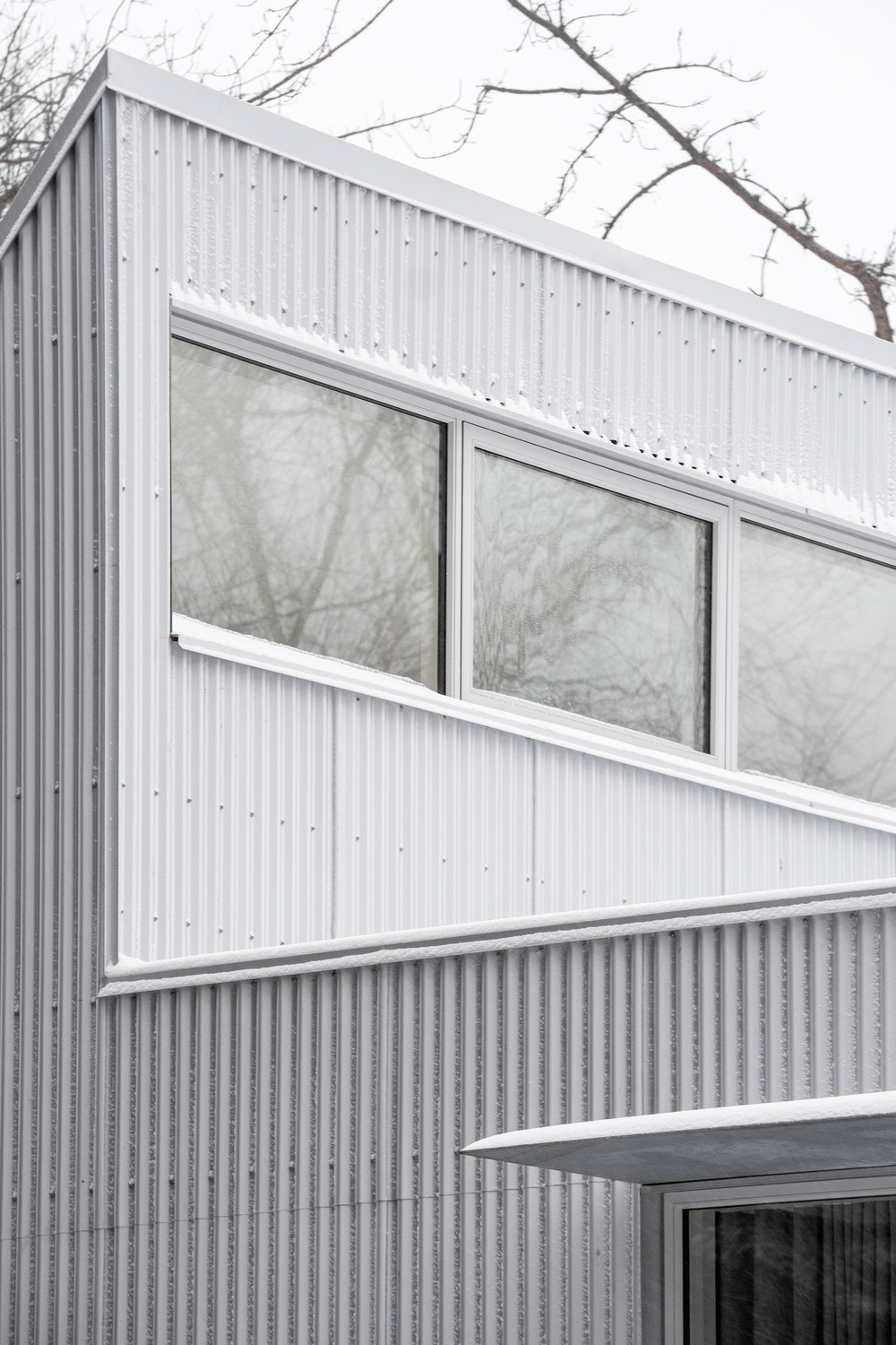
With the original footprint intact, and heights of walls, roof angles, and window-to-wall percentages strictly pre-determined by the City's renovation guidelines, the design process entailed a careful study of the existing worker's cottage typology to be able to de-construct, transform, re-interpret, and re-construct the home in a completely modern way. The main design strategies included flipping the program along the plan's long axis, re-orienting the plan towards the intimate south-facing courtyard, and creating a sense of compression and expansion by reinventing the roof's traditional gable as a 36-foot long sawtooth clerestory to flood the home with natural light and fresh air. Additional apertures were strategically introduced to draw in light from various directions and seamlessly connect the interior to its small garden while obscuring direct views into the home from the outside. Together, these formal and phenomenological strategies create a sense of a highly animated, ever-unfolding space that defies the physical boundaries of the 720sf home.
These design decisions were a direct response to the client's mandate: a desire for abundant light, peacefulness, and a relative sense of seclusion from her busy urban surroundings. In response to this desire for inspired solitude – where one can be alone, but not lonely – the home has been transformed into a vessel of light and shadow, where the two almost seem to inhabit the space, alongside Laurel. Despite its relatively minimalist aesthetic, the home always feels full. To further emphasize this, the 16-foot-tall interior facade of the home's north wall, which forms a backdrop to the home’s main living spaces, acts as a projection screen for the ever-changing colour, glow, and shadow of the passing day and seasons, including the dappled light and arboreal silhouettes of the mature urban forest on the west side of Craven Road.
Aging-In-Place, Affordability, and Maintenance
The home consists of four rooms: a combined entry, living, dining, and kitchen space; a small studio/den that could accommodate a single bed; a combined washroom/laundry room; and a principal bedroom. This straightforward program was complemented by an ageing-in-place strategy that integrates a U-shaped kitchen for easy circulation; a curbless wetroom suitable for accessibility equipment with walls blocked for future grab bars; LED lighting and robust finishes to promote low maintenance and energy bills; sleeping space for a potential live-in caregiver; and a front porch designed to accommodate a future ramp, with a canopy that protects against weather.
To make the most of the budget, the firm sourced high-quality, salvaged fixtures. To ensure the house would be easy to build, hardwearing, energy efficient and economical to maintain, they sourced easily obtainable materials, including corrugated steel with a Galvalume finish for the exterior cladding and roofing, and prefinished wood floors.
Sustainability
The design for this 720 sf home made use of every element of the space and budget to minimize energy consumption through the implementation of a high-performance envelope, high-efficiency equipment, and energy-efficient fixtures; redeploying the original foundation and shoring system to avoid sending carbon-intensive concrete to landfill; and leveraging passive heating, cooling, ventilation, and natural lighting through the strategic orientations, apertures, and exterior planting.
The energy performance benefited greatly from the placement and orientation of the clerestory windows, which were designed in coordination with the mechanical designer’s development of the energy model. It led to significant passive solar gain during the winter months and accounted for almost a quarter of the home’s space heating energy requirements.
Conclusion
Anya Moryoussef sought to address the following: How can you respect the street’s vernacular fabric and cultural history, while reimagining the worker’s cottage typology to create a restorative and hyper-functional home? How do you build “small”, affordably, and sustainably, while also prioritizing uplifting design that supports psychological health and ageing-in-place? How do you work within rigid municipal renovation requirements, while effectively rebuilding the home from the foundation?
This light-filled home, with its small but expansive spaces, was described by renowned national architecture critic Alex Bozikovic as “A simple idea, constructed with ordinary building materials — but a beautiful idea that’s executed beautifully
Technical sheet