At 10,000sq.ft, this two storey mansion enriched with natural light and seamlessly camouflaging into the hues of neutrals unfolds itself amongst a top-notch vicinity in Chandigarh. And yet, this is exactly the visual identity that Ruby Gupta, Founder of Ruby Signature has managed to confer in this Chandigarh home. “The client wanted a very elegant and elaborate setting, with the classic English look as it’s crowning glory.
Our palette was dominated by neutral tones of ivory, beige whilst every room was enhanced with an accent colour. However, every room has been meticulously planned and decorated with ornate bedding and intricate soft furnishings in accordance to the individual character and preferences of our client,” says Ruby.
Also Read | Five interesting ways to redefine your kitchen
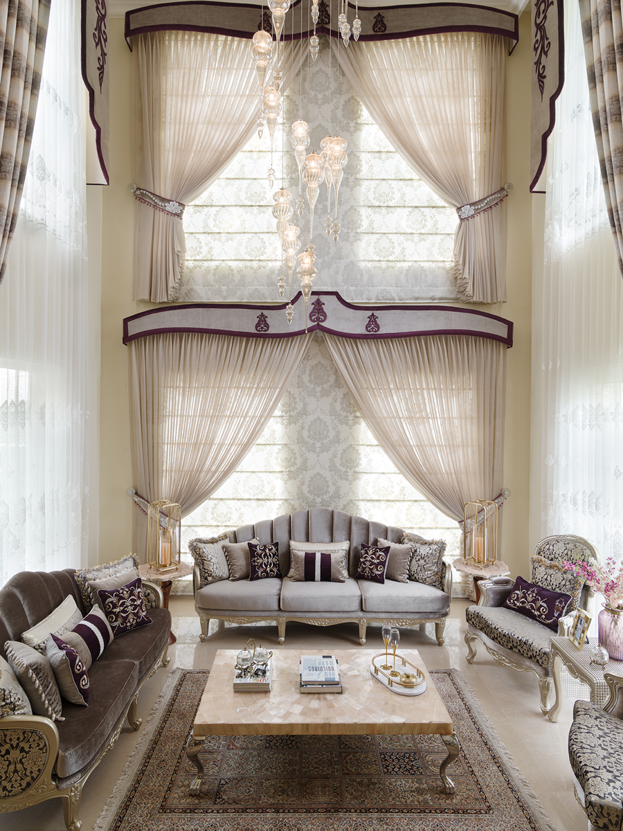
“However, the most challenging yet exciting area to design within the entire house was the drawing room." 
\A large double height space, the drawing room has two sets of sizeable windows on three walls overlooking the greens beyond. Draped in a playful yet technical fashion, the windows are adorned with curtains of different sizes and designs. “Since the windows are located at two different heights, we decided to retain its beauty by playing with the draping.”
Therefore, the drape remained the point of interest throughout the tedious process of fabric selection for the curtains since they’re to be suspended at different heights from the ceiling.
Patterns like horizontal stripes was deemed necessary in order to make the room look wider while the sheer curtains were added with the thought that it will function as a screen to retain the beauty of the window design. In addition to curtains, valances were added to enhance the look of the ceiling.
“Designing is all about experimenting and the dining room presented a window for us to explore and experiment with the interior space.”
An expansive space, the dining room is planned in a sensible manner. Draped with layered sheers and curtains on the side, the valance was the perfect element to add to the window. “Since it had the most visibility from the entrance as well as the corridor, we decided on giving a frame to the windows to enhance the French mouldings.” Therefore, the valance was deemed as an integral part of the interior space. Patterns that reflected heavy ornamentation was a necessity and contributed to the overall feel of the room.
Also Read | 5 Innovative ways to incorporate Japanese architectural elements in the Indian home decor
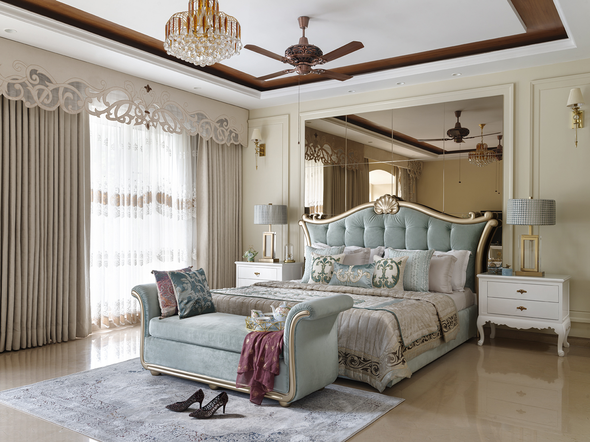
“Neutral colour palette and quilted soft furnishings reiterates the sense of comfort and class in the bedroom.”
Ivory hues, warm accent lighting and manicured floors produce a cosy, classic English vibe in the master bedroom. “Each bedroom is designed with an idea to shed some light upon the individuality of or client.” The neutral quilted foreground, traditionally styled furniture and ceramic highlights in the form of vases and lamps adds to the scene.

“The son’s room strikes a perfect balance between the modern and classy interior by highlighting hints of quilting and ceramics.”
The aim for the son’s room was to keep it modern and trend-forward in terms of colours and finishes. “Throughout the planning and careful selection we have tried to keep in view the client’s personality as well as their individuality. For this particular room, we were given the brief to transform it into a modern space with an attention the intricate handwork.”
Decorated in an elaborate fashion, the soft furnishings were embellished with details like fringing, quilting, embroidery and laser cutting which not only enhanced the overall essence of the interior setting but complimented it. Ceramic and brass accents in the form of lamps, vases and pots imparted luxe to the room.
Also Read | Deck up your home with Pantone Colored Marbles