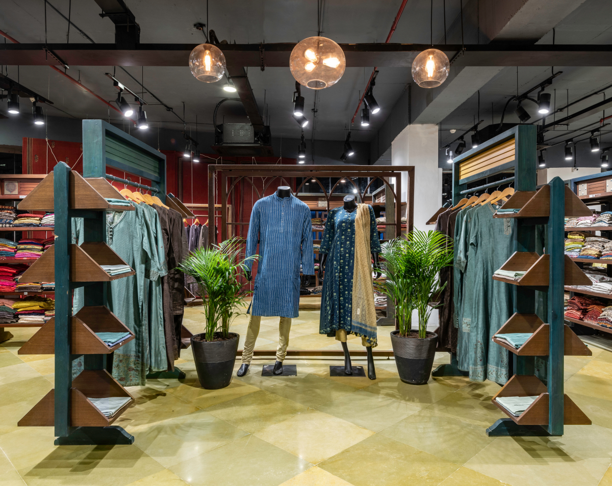
The facade which holds the mannequin display is captivated by the Red Ajrakh printed blinds, and stands in contrast to the muted interior spaces along with the indigo blue branding. It also embraces traditional furniture pieces and accessories which give a glimpse of the store from the street. As one enters the store through a narrow lift lobby, an open central display area is used to showcase the latest collection of the store and entices the user to take a stroll through the space.
Also Read: Take a glance of Parineeti Chopra’s home to get some pristine views of the Arabian sea and more
The spaces have been accommodated with the maximum number of display racks without compromising on the circulation. The racks have been distributed such that provide wide alleys for selection along with tables in the centre and floor mounted as well as wall mounted mirrors found along the length of the store.

The flooring chosen for this space is of yellow kota cultivating the theme of the store with a mirror polish that reflects a smooth light enhancing the tone of the space. The store embraces a long length of curved facade which has been emphasised with a variation in flooring pattern, using smaller diagonal pieces of yellow kota stone to create a visual distinction between the window display and the interior display.
The charcoal grey exposed ceiling is an attempt to embrace the rawness of the space thereby striking a contrast with the earthy interior elements. The lighting scheme is a combination of industrial and contemporary, a distinction in lighting has been done for the central display portion in order to highlight the zone.
Also Read: William Duff Architects (WDA) Emerges as a Firm to Watch in Architecture and Design
To have a glimpse of the space, check out the gallery that consist of the design process illustration drawings i.e Plan, Elevations, Section. We hope you enjoy the images as much as we enjoyed designing it.
Fact file: